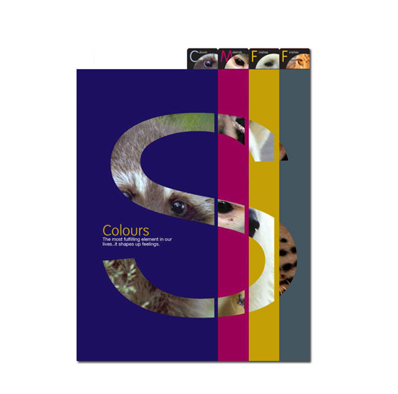
I was given a task to plan and design a printing guide book. The book will talk about colours, materials, finishing and finishes. The book itself will be really printed on special paper, colour and with certain finishing and finishes to show customers what we can do for them. The theme of the book is nature. So, that time I was thinking of either using fauna or flora as the main object.
As the book is divided into 4 sections as mentioned above, therefore, I created tabs as a divider for each section. The book title given by my Director is SIGHT. The name led my design direction later on in choosing the pictures. Pictures used are for sample only and I don’t own it.
SIGHT = EYES


